BMW logo
![]()
The company «Bayerische Motoren Werke AG» was founded in 1916 in Munich by the union of two small businesses — «Rapp-Flugmotoren Werke» and «Otto-Werke». These establishments had been producing aircraft engines since 1913.
| Information about the company BMW Motorrad | |
|---|---|
| Founded | 1916 |
| Founder | Franz Josef Popp Karl Rapp Camillo Castiglioni |
| Key people | Hendrik von Kuenheim (General Director) |
| Headquarters | Berlin, Germany |
| Slogan | ”Sheer Driving Pleasure” (Worldwide) “The Ultimate Driving Machine” (United States, United Kingdom) “The Ultimate Driving Experience” (Canada) “Freude am Fahren” (Germany) |
| Official website | www.bmw-motorrad.com |
After the association of aircraft manufacturing companies, established in 1913 by Karl Friedrich Rapp and Gustav Otto, they merged into a single concern, «BMW». In 1917 the new firm got a logotype, which is used today without any changes.
BMW Motorcycle History
The company Bayerische Motoren Werke (BMW) produced stylish motorcycles that were in high demand. In its history, there were even moments when motorcycle production was on the verge of stopping. But BMW has always acted on its plan and, as a result, produced a number of the most excellent multipurpose motorcycles ever made.
1913 | Bayerische Motoren Werke is formed, specializing in the production of aircraft engines. |
1919 | A few weeks later, the Treaty of Versailles was signed, according to which Germany was forbidden to produce aircraft. BMW had no choice but to start producing motorcycles. |
1920 | Developed the two-stroke Kurier engine. |
1921 | 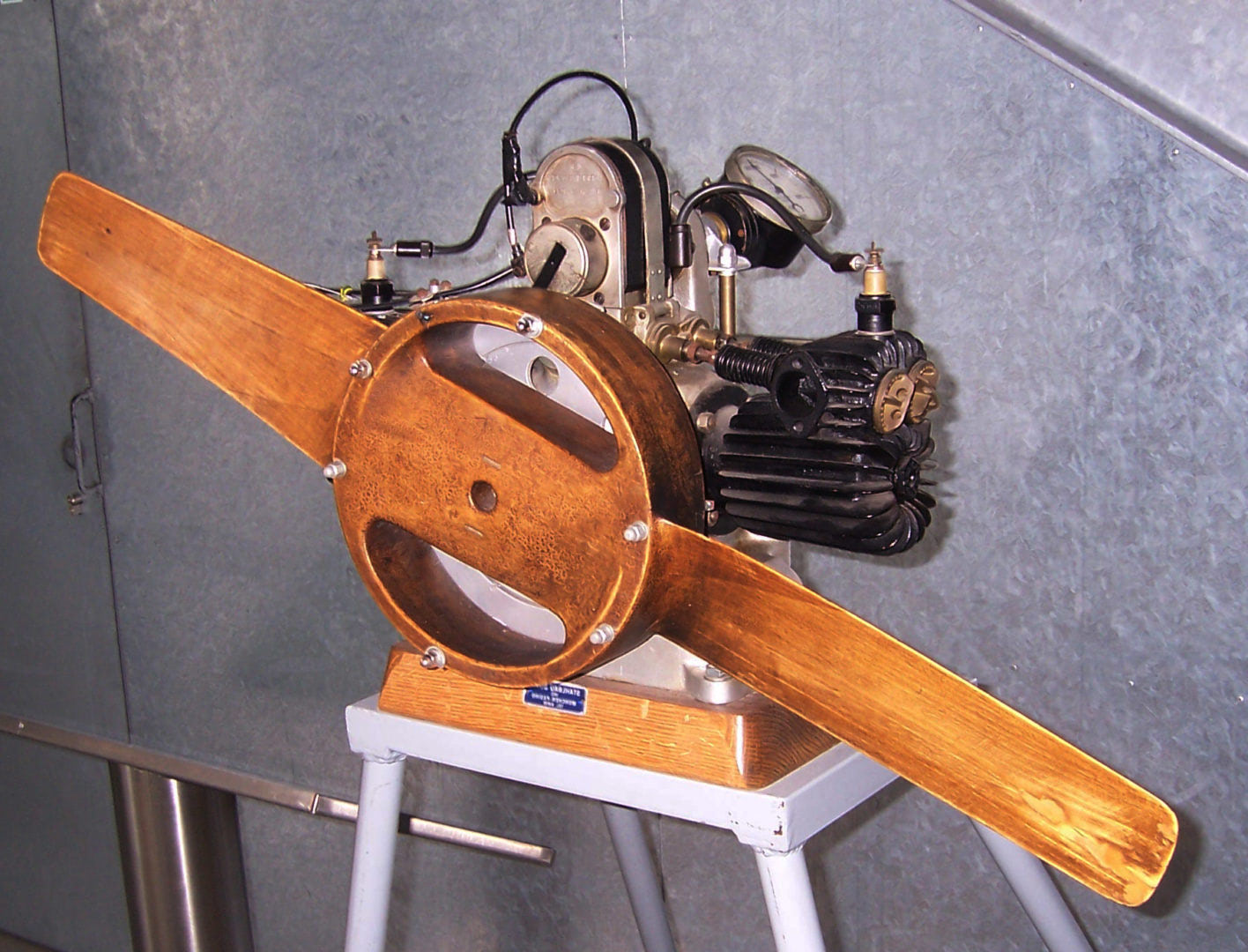 Developed the M2B15 motorcycle model, which used the first BMW motorcycle engine, also known as the "Boxer." Developed the M2B15 motorcycle model, which used the first BMW motorcycle engine, also known as the "Boxer." |
1923 | 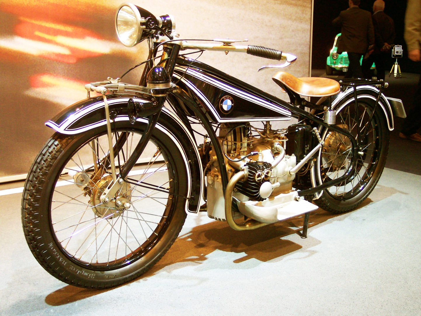 Legendary BMW designer Max Fritz locked himself at home and created drawings for a completely new motorcycle. The R32 model with a 486 cc engine was demonstrated in Paris. The new model could reach speeds of about 100 km/h. Legendary BMW designer Max Fritz locked himself at home and created drawings for a completely new motorcycle. The R32 model with a 486 cc engine was demonstrated in Paris. The new model could reach speeds of about 100 km/h. |
1925 | 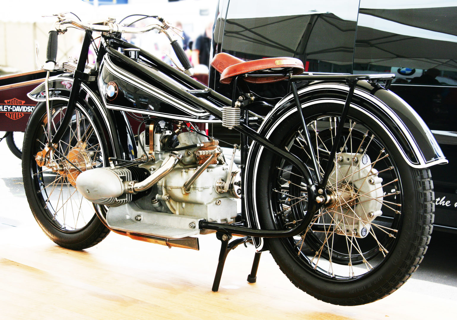 Released the racing version of the R32 under the index R37. The R37 model began to feature front brakes, which were subsequently used on the R32 as well. Released the racing version of the R32 under the index R37. The R37 model began to feature front brakes, which were subsequently used on the R32 as well. |
1927 | 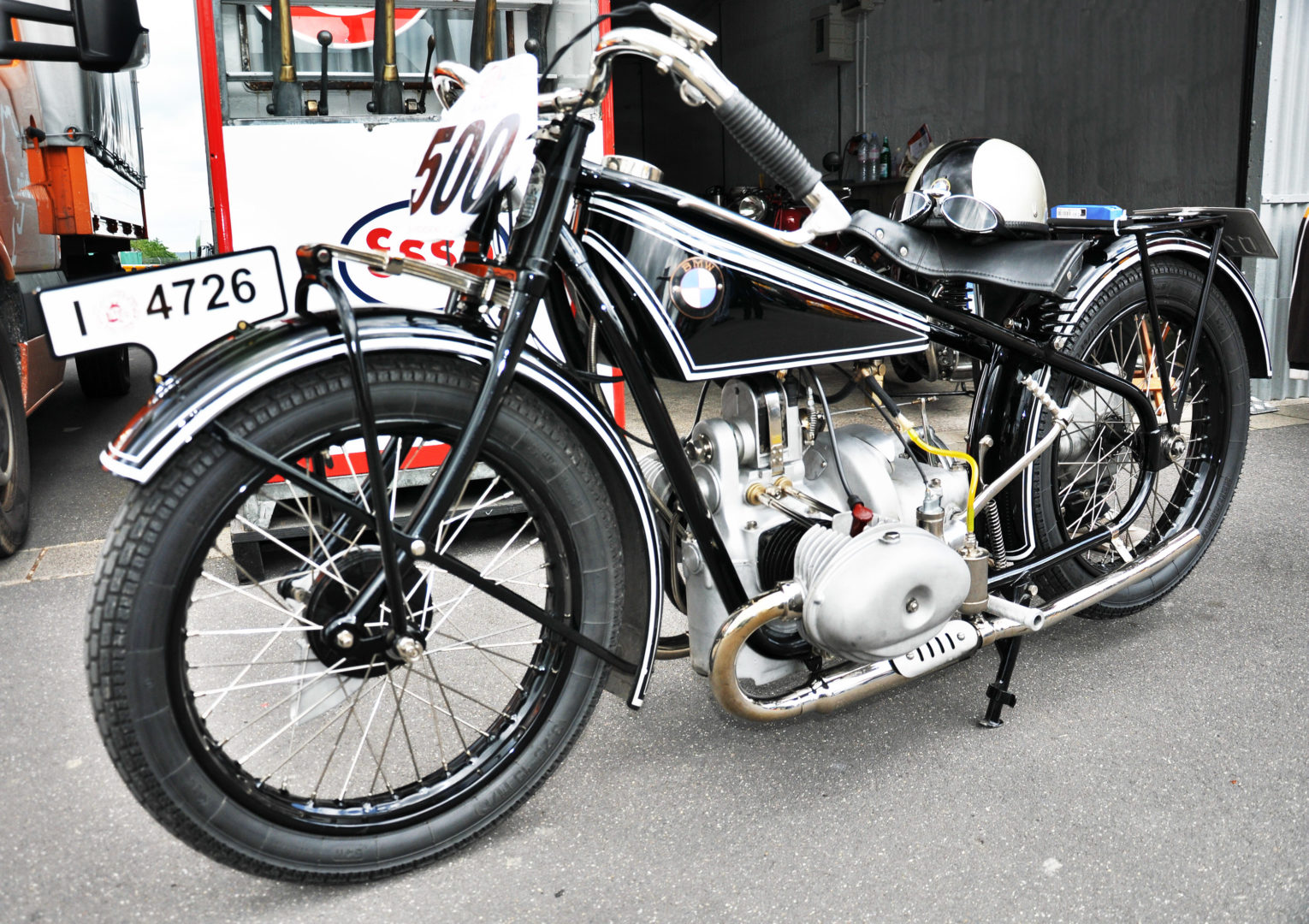 BMW developed the R47 motorcycle model, intended to replace the R32, R37, and R39. BMW developed the R47 motorcycle model, intended to replace the R32, R37, and R39. |
1928 | 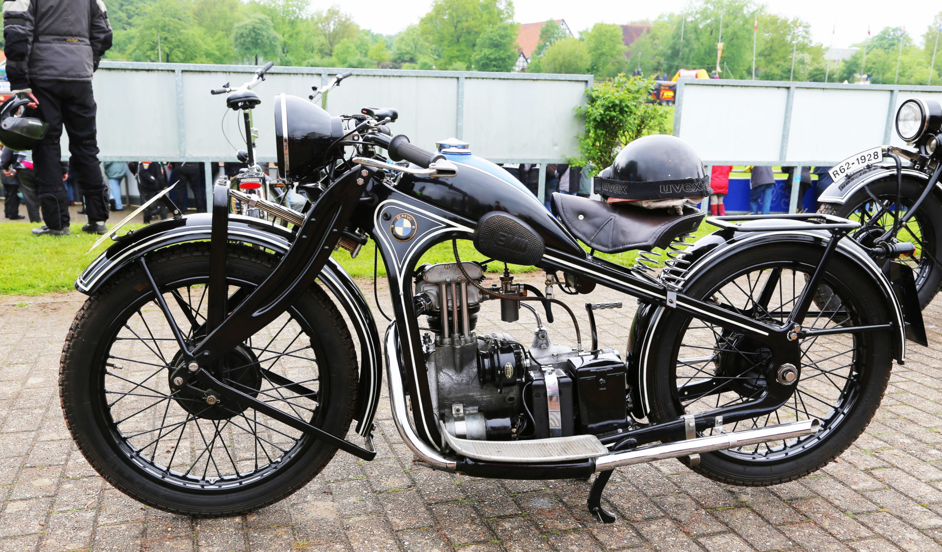 BMW began to produce the largest motorcycle of its time, the R62, with a 750 cc engine capable of reaching a speed of 114 km/h. BMW began to produce the largest motorcycle of its time, the R62, with a 750 cc engine capable of reaching a speed of 114 km/h. |
1930 | 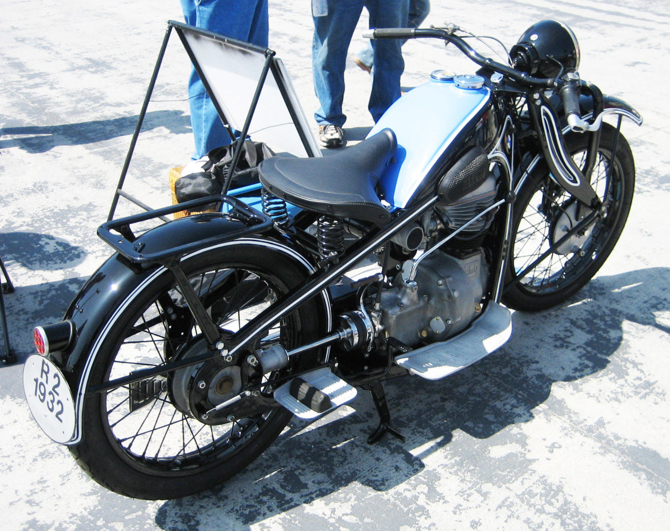 The economic crisis in Germany forced BMW to start producing a small R2 motorcycle with a 198 cc engine. The peculiarity of the engine was its unusual crankcase design. Small motorcycles with engines up to 200 cc in Germany did not require a license to drive, so the R2 reached sales of 15,000 units. The economic crisis in Germany forced BMW to start producing a small R2 motorcycle with a 198 cc engine. The peculiarity of the engine was its unusual crankcase design. Small motorcycles with engines up to 200 cc in Germany did not require a license to drive, so the R2 reached sales of 15,000 units. |
1932 | 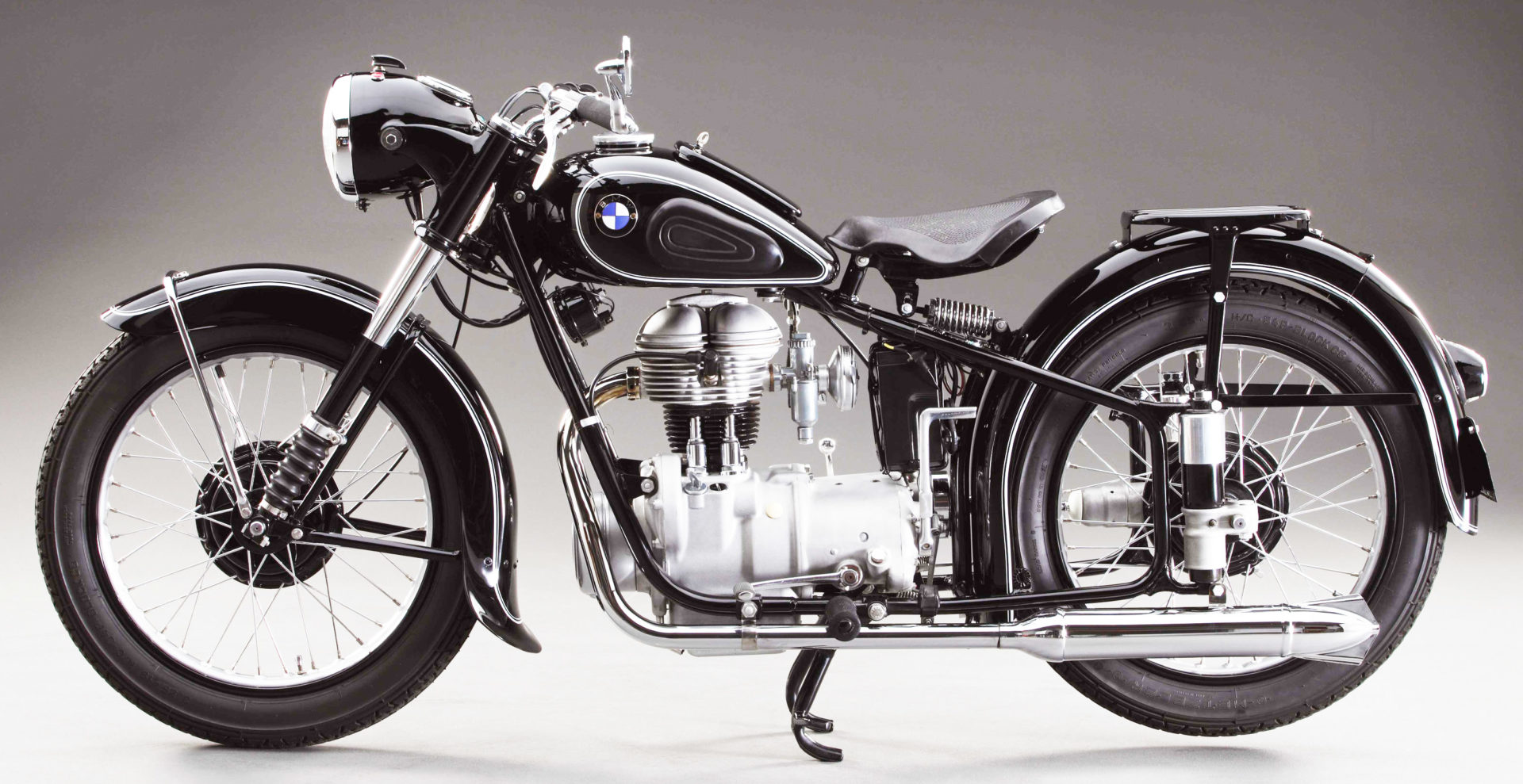 They released the R4 motorcycle model. It featured a single-cylinder engine with an overhead valve arrangement of 398 cc. They released the R4 motorcycle model. It featured a single-cylinder engine with an overhead valve arrangement of 398 cc. |
1933 | The German army concluded a contract with BMW to produce R4 motorcycles for its needs, which allowed the company to stay afloat during the Great Depression. |
1935 | 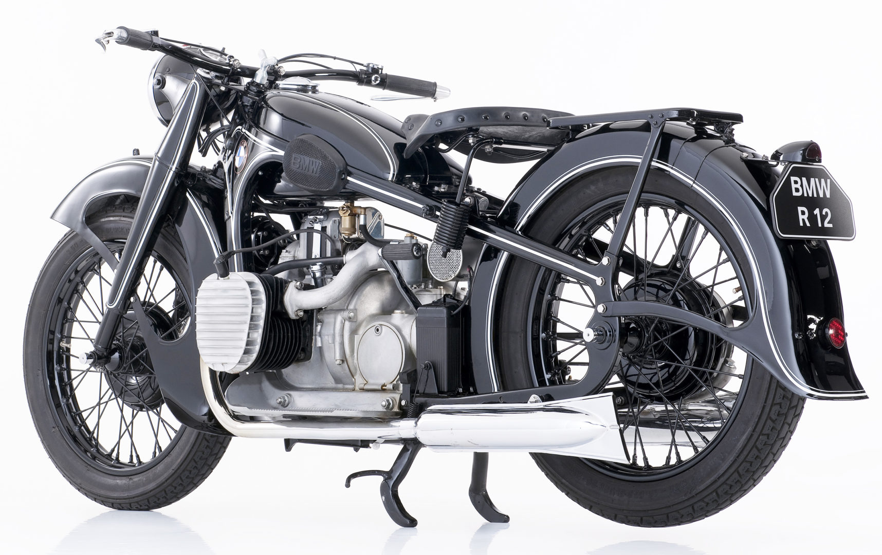 Production of the R12 motorcycle with an engine capacity of 745 cc began. Production of the R12 motorcycle with an engine capacity of 745 cc began. |
1936 |  The Model R5 became the first BMW motorcycle with running boards. Also, production of the R7 model began with an engine capacity of 500 cc, capable of reaching a speed of 140 km/h. The Model R5 became the first BMW motorcycle with running boards. Also, production of the R7 model began with an engine capacity of 500 cc, capable of reaching a speed of 140 km/h. |
1938 | 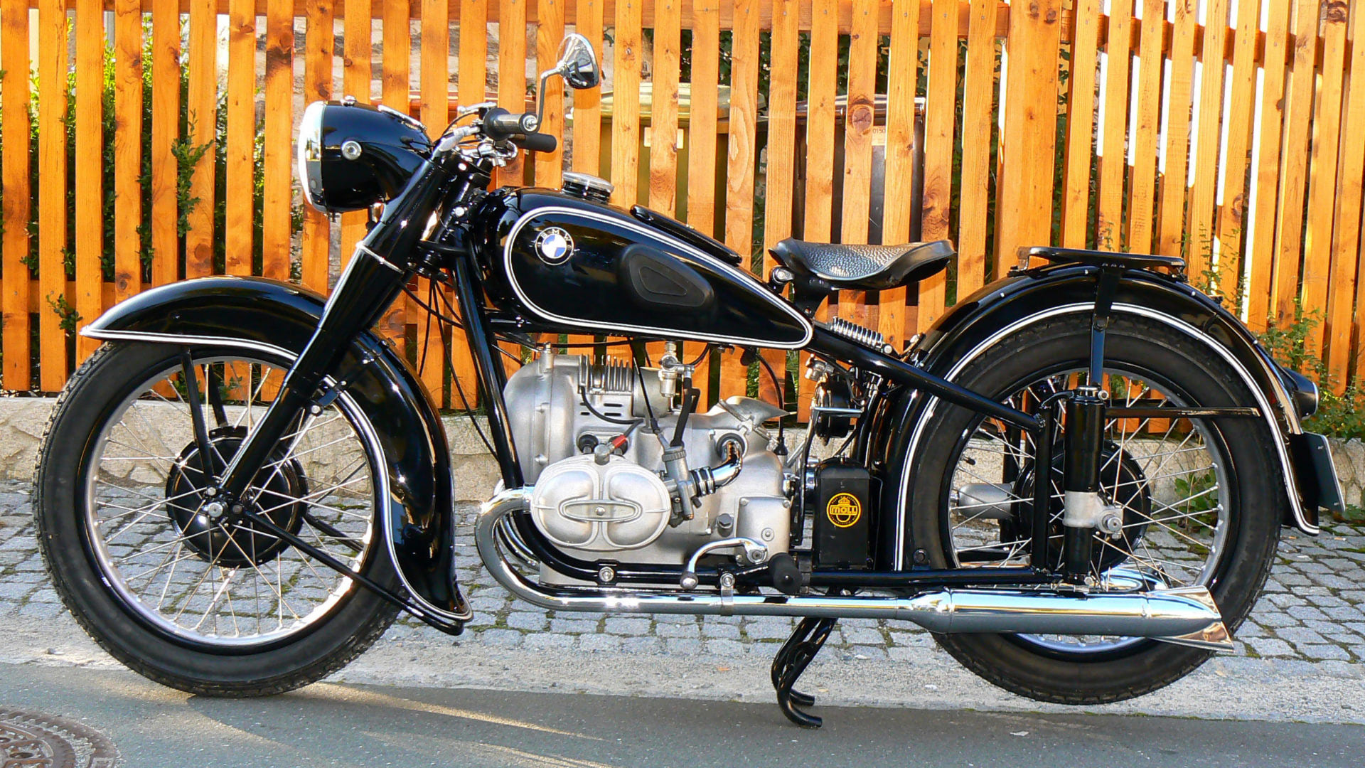 Starting with the R61, BMW began to install footrests on their entire range of motorcycles. This year, production began for six new motorcycle models, including the R23, R51, R66, and R71. Starting with the R61, BMW began to install footrests on their entire range of motorcycles. This year, production began for six new motorcycle models, including the R23, R51, R66, and R71. |
1941 | 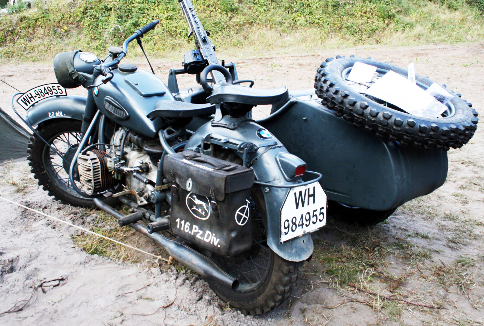 BMW began production of the R75 motorcycle, specially designed for military use. The US military was impressed by the capabilities of the R75 and the similar Zündapp model. Captured German bikes were sent to Harley-Davidson and Indian plants to start producing motorcycles with similar characteristics. Some 1,000 prototypes were produced, but they were never actively used. BMW began production of the R75 motorcycle, specially designed for military use. The US military was impressed by the capabilities of the R75 and the similar Zündapp model. Captured German bikes were sent to Harley-Davidson and Indian plants to start producing motorcycles with similar characteristics. Some 1,000 prototypes were produced, but they were never actively used. |
1946 | At the end of World War II, BMW stopped producing motorcycles and concentrated on the development and production of bicycles. |
1948 | 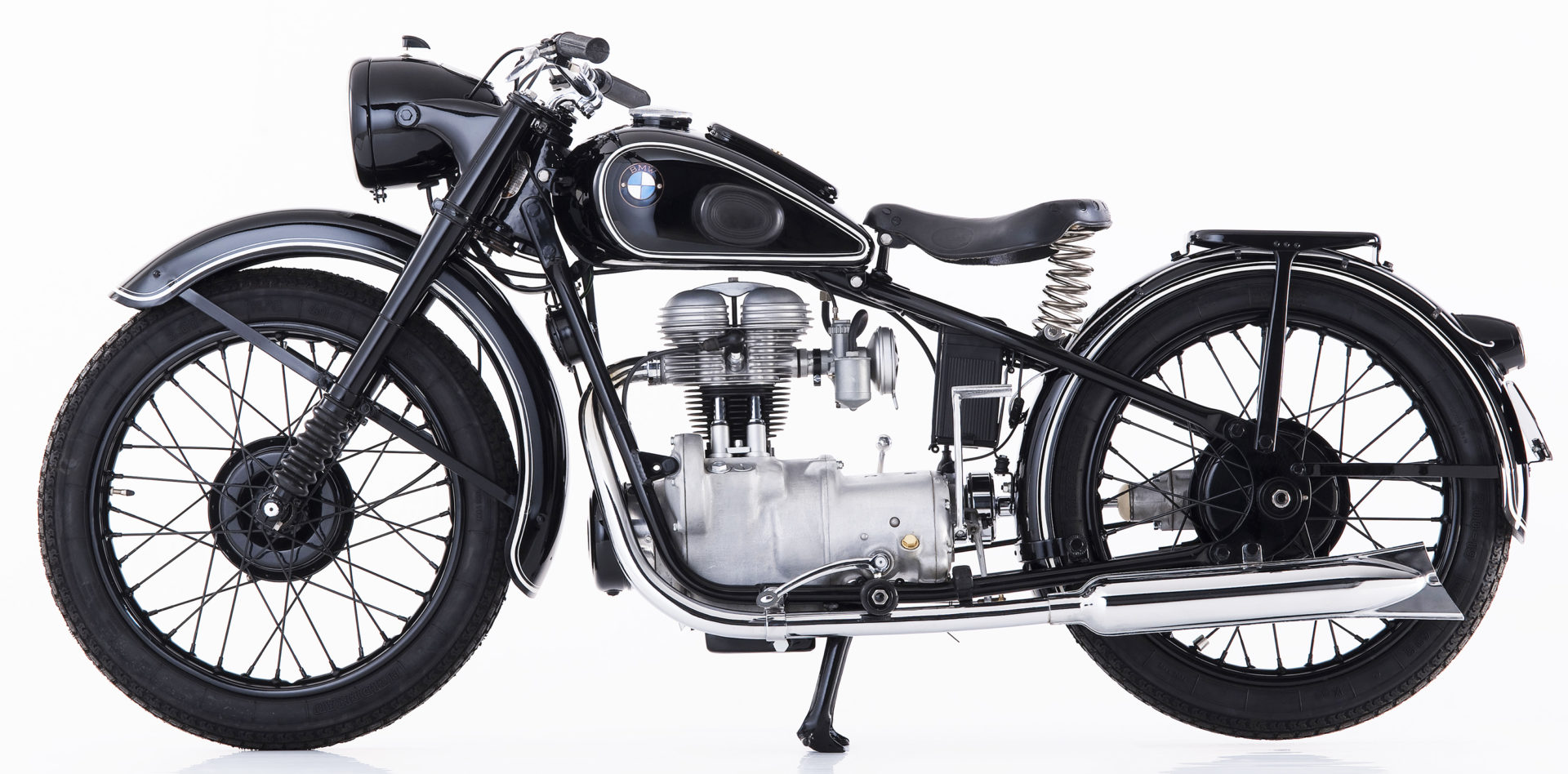 BMW started producing again. The R24 became the first model on the assembly line. It used a 250 cc engine, the maximum allowed under the peace treaty at that time. BMW started producing again. The R24 became the first model on the assembly line. It used a 250 cc engine, the maximum allowed under the peace treaty at that time. |
1949 |  BMW started producing new R50/2 and R51/2 motorcycle models. The quality of the motorcycle assembly was low. BMW started producing new R50/2 and R51/2 motorcycle models. The quality of the motorcycle assembly was low. |
1950 | 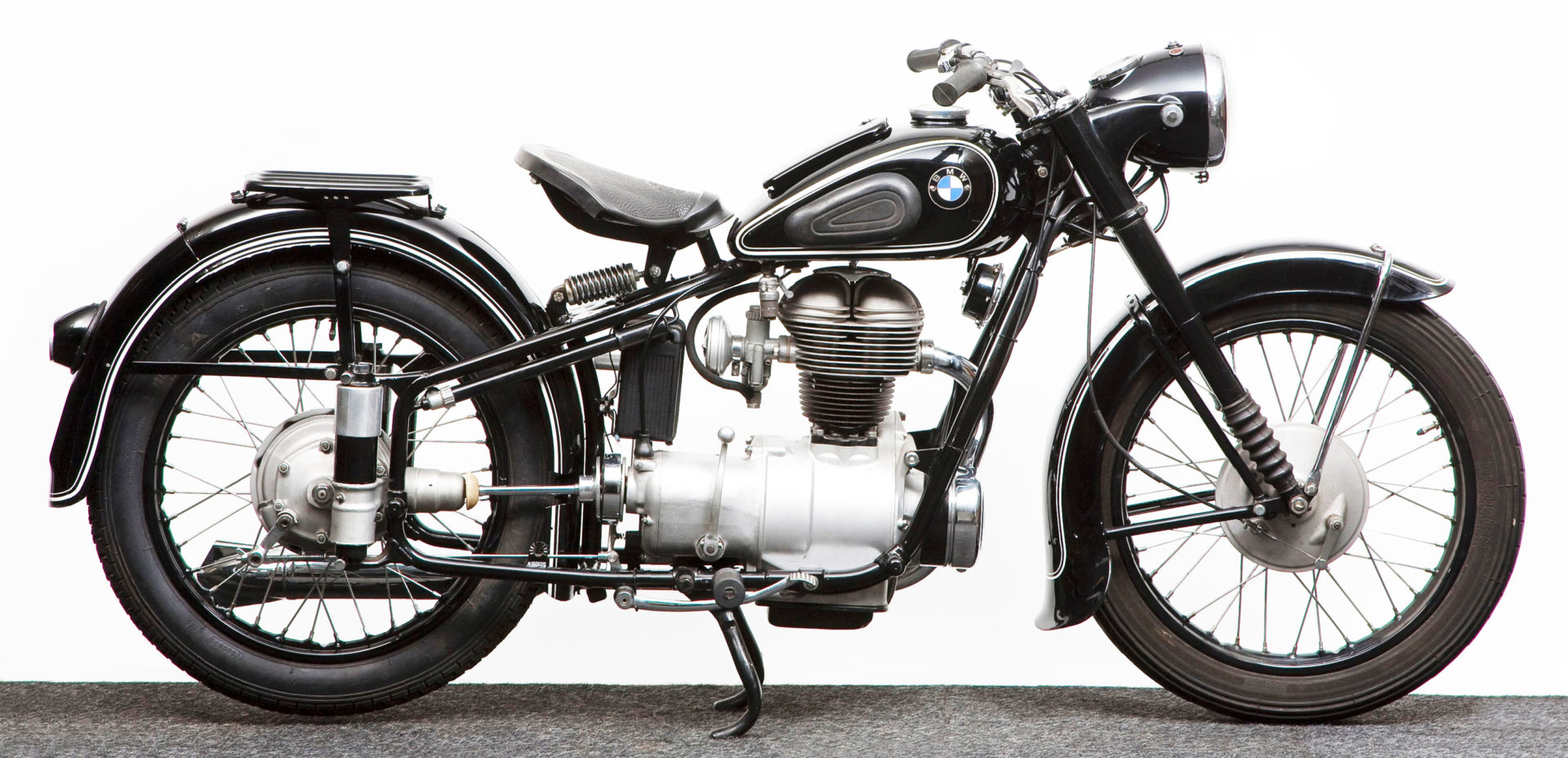 Production of the R25 model began, featuring rear hydraulic shock absorbers. Production of the R25 model began, featuring rear hydraulic shock absorbers. |
1952 | 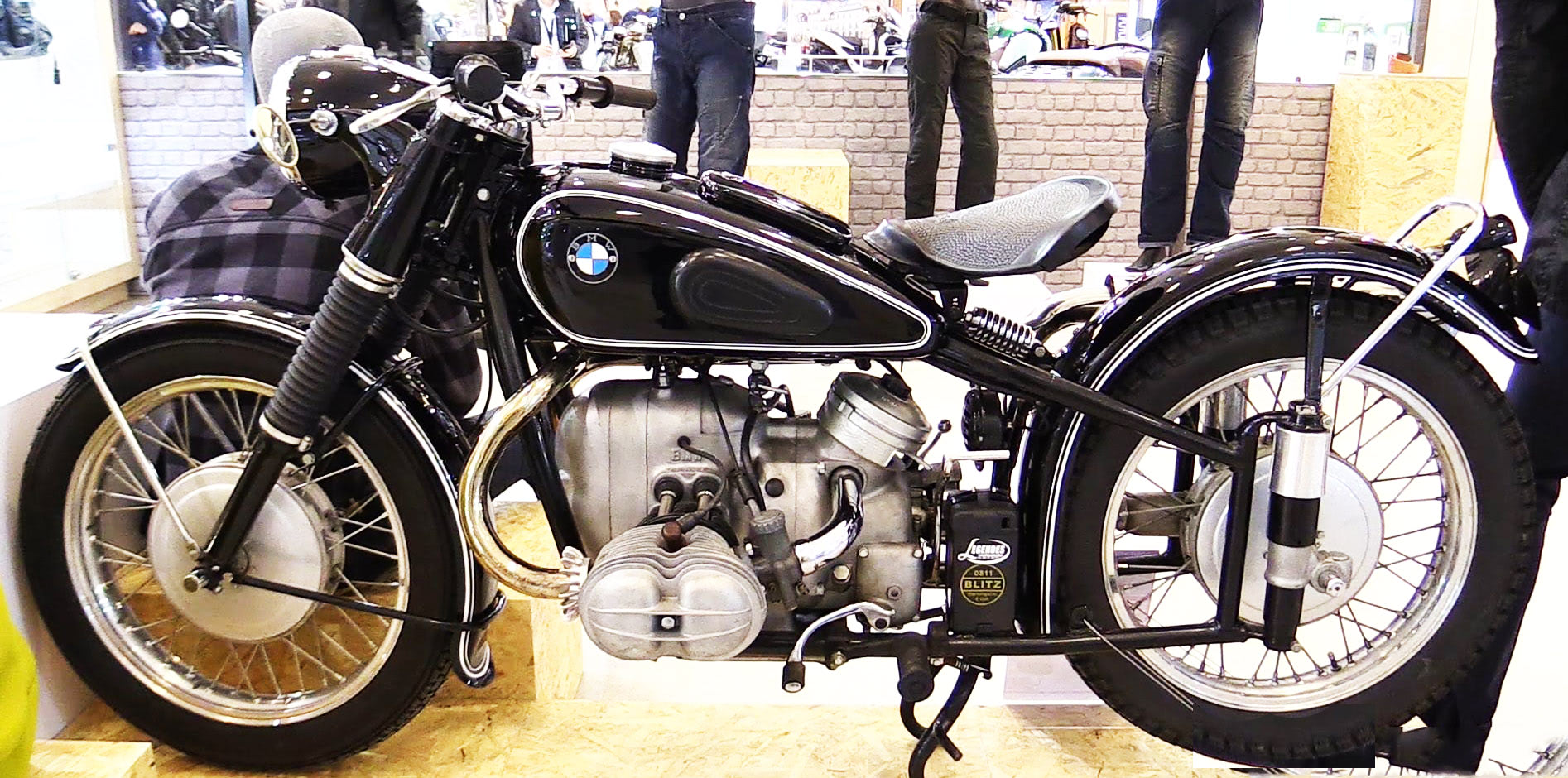 BMW started producing the R67 motorcycle with an engine capacity of 600 cc. BMW started producing the R67 motorcycle with an engine capacity of 600 cc. |
1953 | 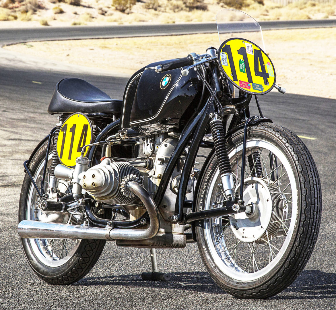 Production of the RS series of motorcycles began. Motorcycles were equipped with a swingarm suspension. The RS54 Rennsport motorcycle appeared. Production of the RS series of motorcycles began. Motorcycles were equipped with a swingarm suspension. The RS54 Rennsport motorcycle appeared. |
1954 | The team consisting of Wilhelm Noll and Fritz Crone won the World Sidecar Championship. |
1955 |  Production of the R50, intended to replace the R51/3, began. Production of the R50, intended to replace the R51/3, began. |
1957 | The number of motorcycles produced fell from 23,531 in 1955 to 5,429 in 1959 due to the economic crisis. |
1960 | 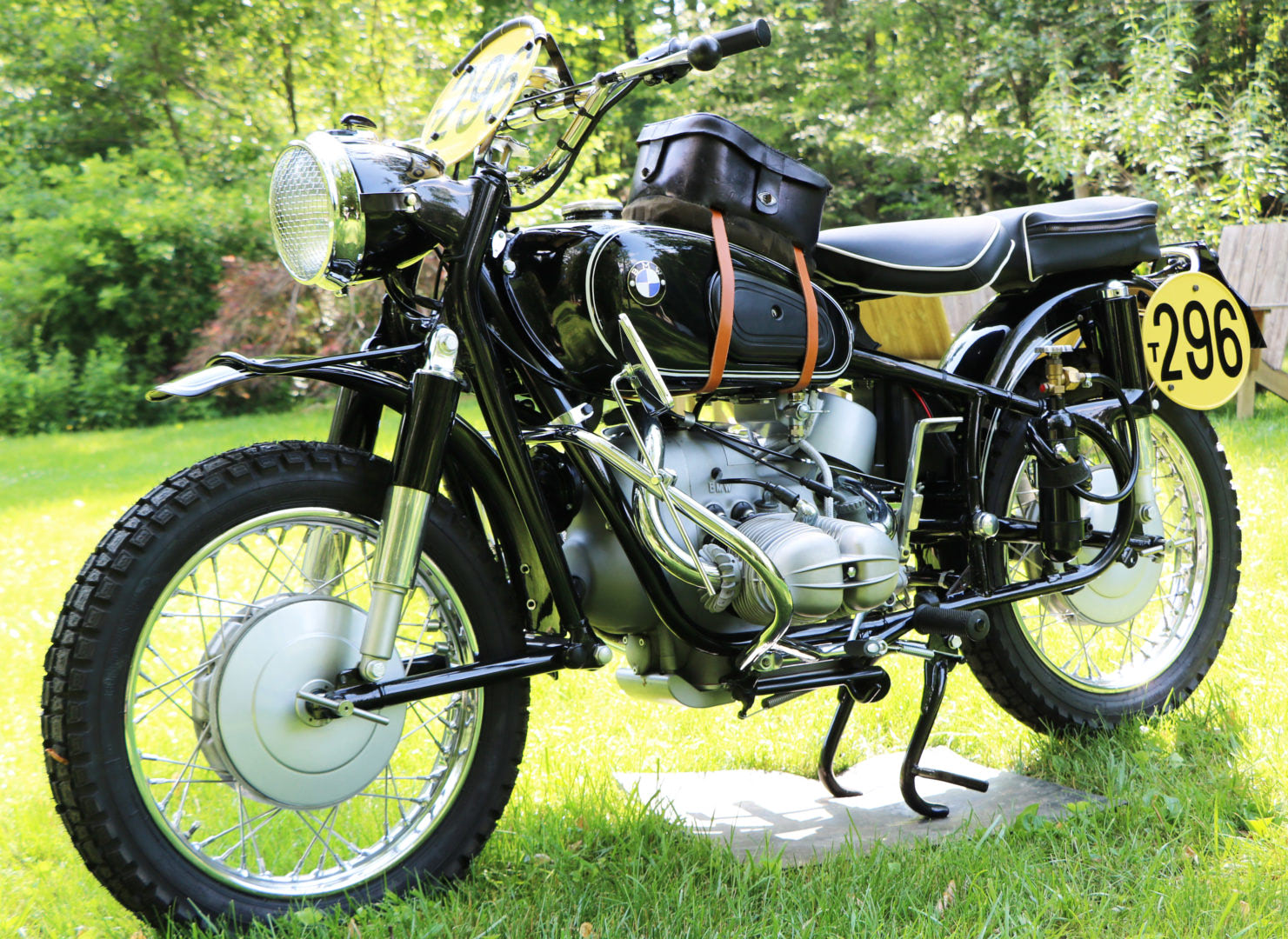 Production of the classic R69 began. It became the fastest motorcycle, reaching a speed of 175 km/h. Production of the classic R69 began. It became the fastest motorcycle, reaching a speed of 175 km/h. |
1967 | Special export versions of the R60 and R69 motorcycles were developed for the North American market. These motorcycle models for the period from 1961 to 1968 were not launched into production. |
1969 | Production of a new series of motorcycles equipped with an electric starter began. |
1973 | 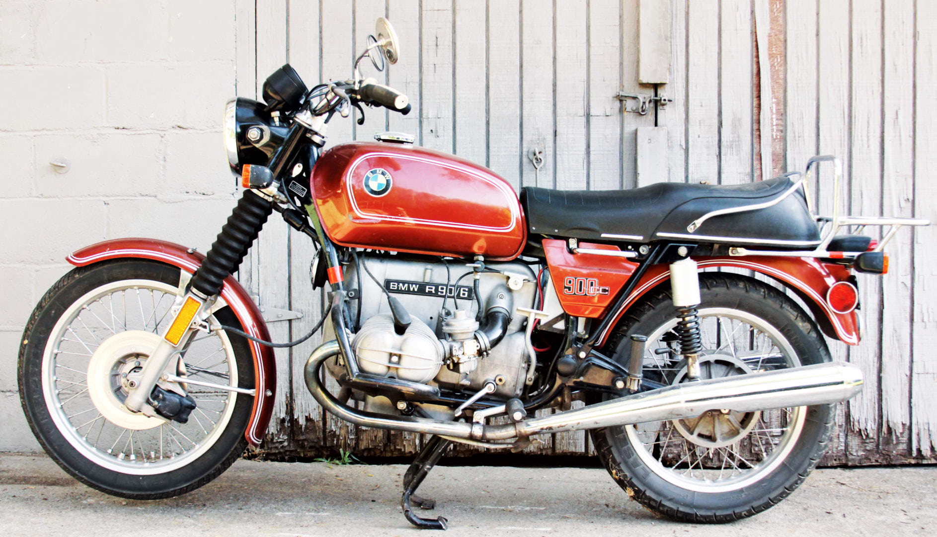 BMW celebrated its fiftieth anniversary and produced its 500,000th motorcycle off the assembly line. The release of the R90S model with an engine volume of 900 cc began. Production of the /6 series of motorcycles began. Motorcycles were equipped with engines of 600, 700, and 900 cc. BMW celebrated its fiftieth anniversary and produced its 500,000th motorcycle off the assembly line. The release of the R90S model with an engine volume of 900 cc began. Production of the /6 series of motorcycles began. Motorcycles were equipped with engines of 600, 700, and 900 cc. |
1974 | For the first time, BMW started to install a five-speed gearbox on production motorcycles. |
1976 |  Production of the /7 series of motorcycles began, including the R100/7 model with a 1000 cc engine. Production of the R100RS motorcycle also began, equipped with a similar 1000 cc engine and reaching a maximum speed of 200 km/h. Production of the /7 series of motorcycles began, including the R100/7 model with a 1000 cc engine. Production of the R100RS motorcycle also began, equipped with a similar 1000 cc engine and reaching a maximum speed of 200 km/h. |
1977 |  Production of the R80/7 model began, which became the leader among police motorcycles. Production of the R80/7 model began, which became the leader among police motorcycles. |
1978 |  Production of the R100RT touring motorcycle with an aerodynamic fairing began. Although the R45 model with a 473 cc engine also appeared. Production of the R100RT touring motorcycle with an aerodynamic fairing began. Although the R45 model with a 473 cc engine also appeared. |
1980 | 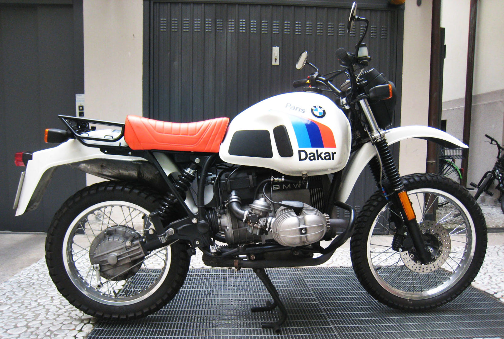 Production of the enduro R80G/S with an 800 cc engine began. Production of the enduro R80G/S with an 800 cc engine began. |
1981 | Hubert Auriol won the third Paris-Dakar rally on a BMW R80G/S motorcycle specially prepared for harsh conditions. |
1982 |  BMW began to produce a road version of the R80G/S - the R80RT. BMW began to produce a road version of the R80G/S - the R80RT. |
1983 |  Production of the K100 motorcycle began - this was the first K-model with a liquid-cooled engine. Production of the K100 motorcycle began - this was the first K-model with a liquid-cooled engine. |
1985 |  BMW created its first K75 motorcycle model with a three-cylinder engine. BMW created its first K75 motorcycle model with a three-cylinder engine. |
1986 |  BMW radically upgraded the R100RS, using a monoshock rear suspension. BMW radically upgraded the R100RS, using a monoshock rear suspension. |
1987 | 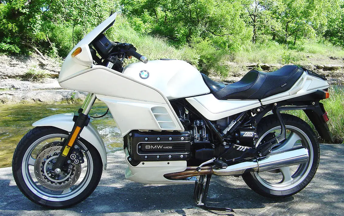 The premium-class K100LT motorcycle with an engine capacity of 1000 cc was presented. The premium-class K100LT motorcycle with an engine capacity of 1000 cc was presented. |
1988 |  Production of the R100G/S began, known as the largest enduro in the world due to its weight of 210 kg. Production of the R100G/S began, known as the largest enduro in the world due to its weight of 210 kg. |
1989 | 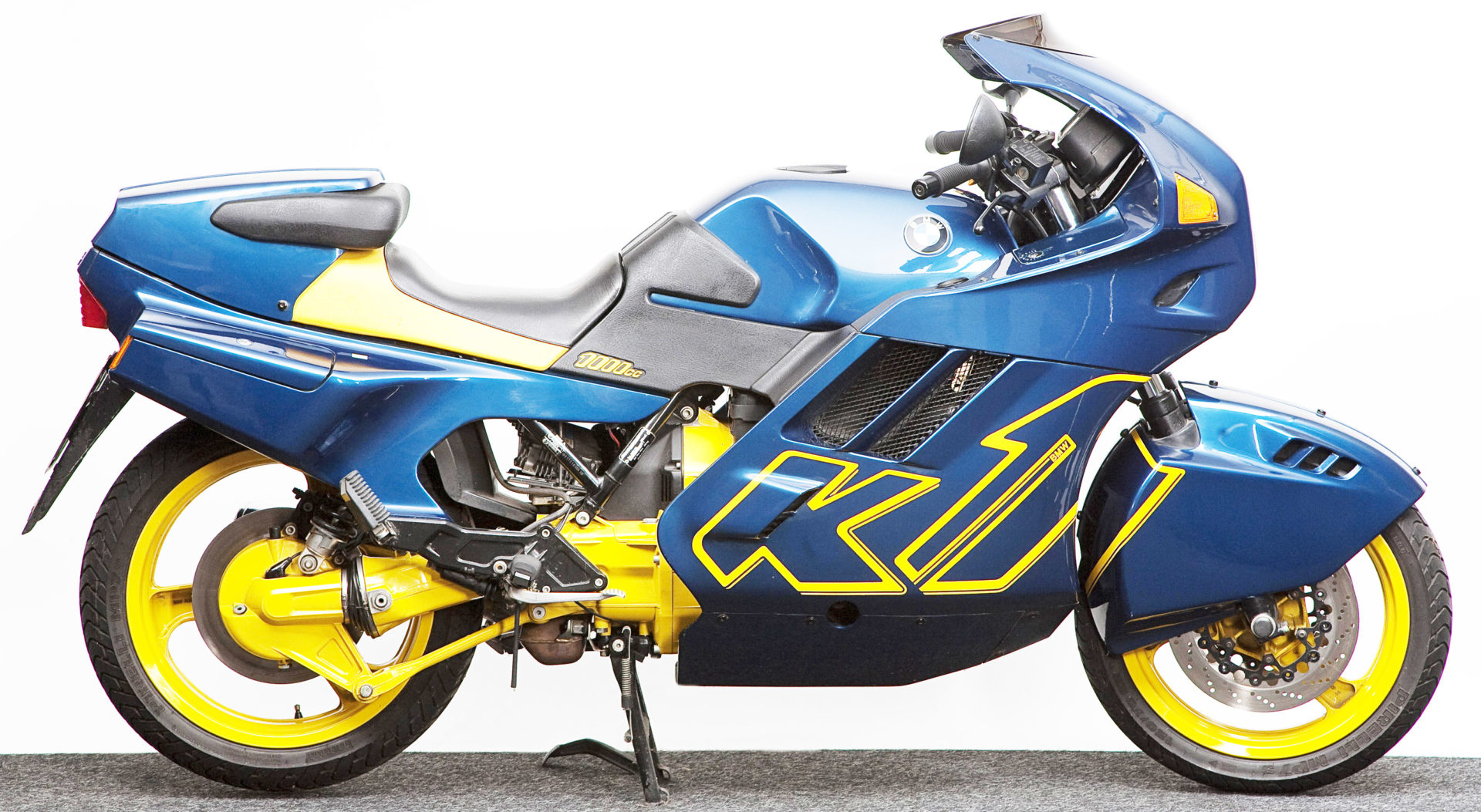 Production of the K1 model began. Production of the K1 model began. |
1990 | Production of the K100RS motorcycle with a four-valve engine began. ABS was installed on all K-series models. |
1991 | The millionth BMW motorcycle was produced, which was a three-cylinder K75RT model. |
1993 | 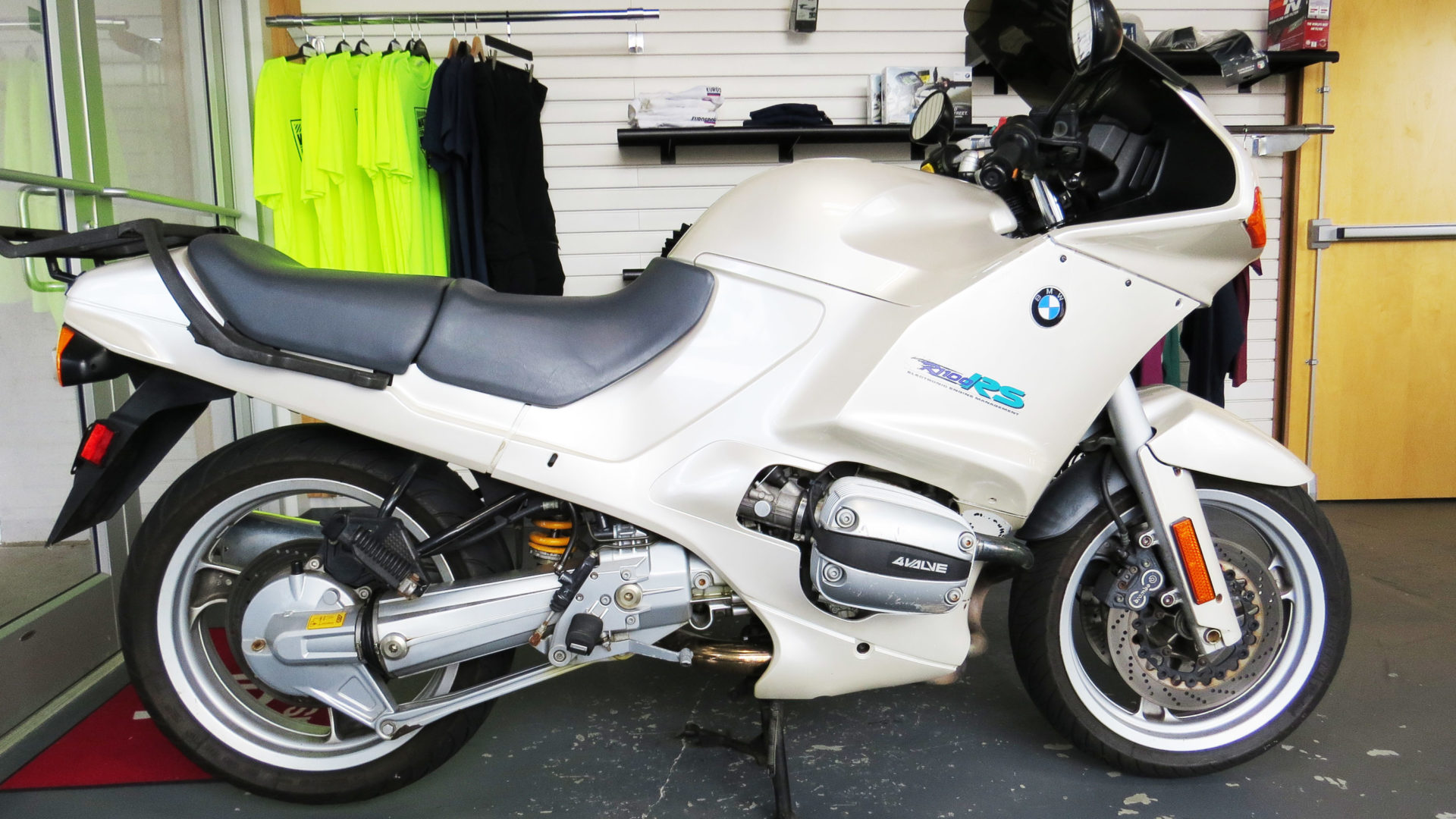 Production of the sports tourer R1100RS began, which used a fuel-injected two-cylinder eight-valve engine. Production of the sports tourer R1100RS began, which used a fuel-injected two-cylinder eight-valve engine. |
1994 | For the first time in 30 years, a motorcycle was produced with a single-cylinder engine, the F650 Funduro. |
1995 | This was the last year when traditional two-valve boxer engines were produced. |
1996 |  Production began of the powerful four-cylinder K1200RS motorcycle, with a liquid-cooled engine. Production began of the powerful four-cylinder K1200RS motorcycle, with a liquid-cooled engine. |
1997 | 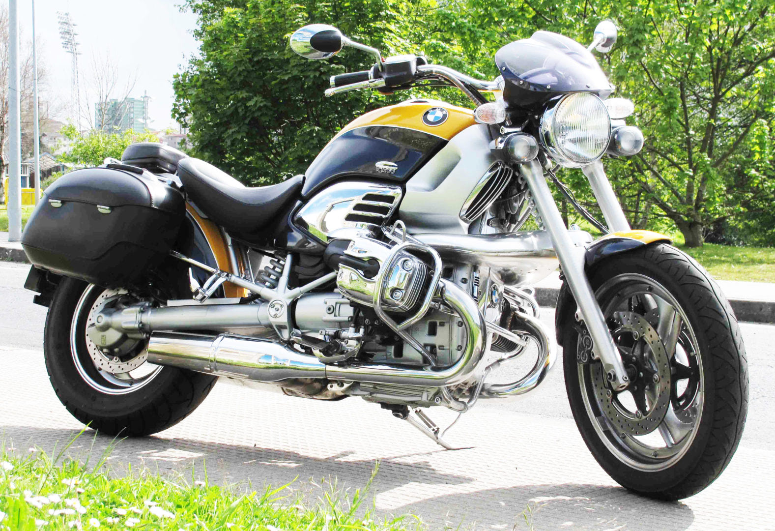 BMW started producing its first cruiser, the R1200C. Even though this model was James Bond's choice, this did not add to the popularity of the motorcycle. After several years, production was discontinued. BMW started producing its first cruiser, the R1200C. Even though this model was James Bond's choice, this did not add to the popularity of the motorcycle. After several years, production was discontinued. |
1999 | Richard Sainct won the Paris-Dakar Rally on the "Funduro," equipped with a single-cylinder 650 cc engine. Officially, this model was called the F650RR. |
2000 | Production of the R1150GS and the premium touring motorcycle K1200LT began. |
2004 | The R1200GS began to feature a new, lighter, and more powerful engine.The K1200S was an entirely new motorcycle for a conservative manufacturer like BMW. The K1200S used a standard four-cylinder engine, which produced 165 horsepower. |
2007 | There were rumors about the preparation of the S1000RR motorcycle, with a four-cylinder liter-class engine, which planned to participate in the World Superbike Championship in 2009. |
BMW Logo History
![]()
Until recently, the history of the origin of the BMW logo had no confirmed facts or evidence of the true origins of the emblem. Today, many people believe that the BMW logo originated from the parent company founded by Karl Rapp. But in fact, this is not true.
The aircraft designer and engineer Karl Rapp worked for Flugwerk Deutschland and was actually the head of the company. The company was engaged in the production and sale of aircraft. However, the shareholders of the company decided to liquidate it and terminate Karl’s services. On October 28, 1913, Karl Rapp and his partner Julius Auspitzer purchased the production facilities of Flugwerk Deutschland and founded their own company, Karl Rapp Motorenwerke GmbH.
The history of BMW begins with two small aircraft engine firms, created respectively by Karl Rapp and Gustav Otto (the son of Nikolaus August Otto, the inventor of the internal combustion engine) in 1913 in Munich. In 1914 The First World War began, and the German state began to experience a great need for aircraft engines. This moved the two designers to unite in one big factory. In July 1917, this plant was officially registered under the name of Bayerische Motoren Werke, and the BMW brand came into being.
![]()
When Karl Rapp Motorenwerke GmbH developed into BMW AG, they wanted the new BMW logo to be based on their previous logo. The Rapp logo was made in the form of a circle where the inscription “Rapp” was printed on top, and “Motor” was printed below; there was a figure of a horse in the middle of the logo.
![]()
The new BMW company used the shape of the Rapp logo and the letter placement, but filled the center with white and blue colors.
![]()
It is commonly believed that there have been 5 stages of change in the history of the logo, namely: 1917 (the very first logo), 1933, 1953, 1979, and the current version of the modern 3D logo since 2000.
1917 | |
1933 | |
1953 | |
1979 | |
2000 |
The basic elements of the logo have not changed throughout the company’s existence:
- Circle
- BMW inscription along the contour of the circle
- Two colors in the middle of the logo which are oppositely located.
Why is the BMW Logo Blue and White
![]()
Another myth concerns the colors filling the center of the logo. Many people believe that the white and blue colors are associated with the sky, and taking into account the history of the company, associated with aircraft manufacturing, and that is why these two colors are present. In fact, these colors were present on the flag of the Free State of Bavaria (which is still a part of Germany today), where the production of the company was located. The Blue and White colors were in the opposite order because, at that time, it was forbidden to use national symbols in trademarks.
BMW logo meaning
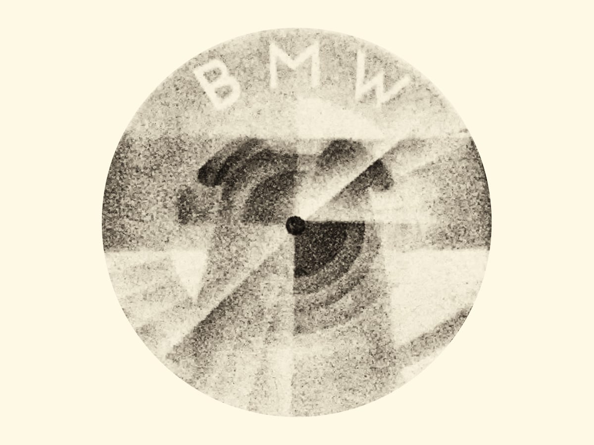
[caption id=“attachment_6220” align=“aligncenter” width=“400”]![]() BMW logo propeller in the journal in 1929[/caption]
BMW logo propeller in the journal in 1929[/caption]
The myth that the modern BMW logo is a legacy of aviation companies appeared after advertising in a magazine published in 1929, which depicted a plane with a rotating propeller showing the letters BMW. This advertising appeared at a time when BMW acquired a license for the creation of Pratt & Whitney aircraft engines, and the advertising department wanted to use the Roundel and the name of BMW in an attempt to increase sales of its engines.
[caption id=“attachment_6221” align=“aligncenter” width=“400”]![]() BMW logo propeller in the journal in 1942[/caption]
BMW logo propeller in the journal in 1942[/caption]
Later, this myth was perpetuated, namely after an article appeared in the BMW magazine in 1942, where a plane with the rotating propeller was also shown.
New BMW Logo
![]()
We are all used to the blue and white BMW logo, which is often called a “propeller”, although it represents the flag of Bavaria. But soon we will have to get used to a new variation. The most expensive and luxurious models from this carmaker will get a new black-and-white logo, which will be accompanied by the inscription “Bayerische Motoren Werke”.
We are talking about several flagship models in different segments. These are the 8 Series coupe, the large BMW X7 crossover, and the BMW i8 hybrid coupe.
By the way, it is the first time in BMW history that the German automaker will use two logo variants on their cars.
Emblem BMW
![]()
The emblem resembles the propeller of a military aircraft. Regarding the color selection, there are two theories. The first variant is propeller blades against the blue sky. The second is connected with the old tradition of painting military aircraft in the colors of the flag of the region (the main colors of the Bavarian flag are white and blue).
![]() «The sky will reflect on your car hood» is an official advertising slogan of «BMW». But not everyone knows that automobiles of this firm really come «out of the sky». In the 19th and early 20th centuries, any vehicle, including the car, was an expensive luxury. Many automobile companies started their careers producing bicycles and their components, motorcycles, aircraft engines, and even the first planes. BMW, although it was carefully hidden, belongs to the latter.
«The sky will reflect on your car hood» is an official advertising slogan of «BMW». But not everyone knows that automobiles of this firm really come «out of the sky». In the 19th and early 20th centuries, any vehicle, including the car, was an expensive luxury. Many automobile companies started their careers producing bicycles and their components, motorcycles, aircraft engines, and even the first planes. BMW, although it was carefully hidden, belongs to the latter.
Pay attention to the modern logotype of the company. The circle, divided into 4 segments, is a «rotating propeller». This is a masked reference to the firm’s very first occupation (production of aircraft engines). The main colors are white and blue (the primary colors of the Bavarian flag).