BMW Logo History (evolution)
![]()
Until recently, the history of the origin of the BMW logo had no confirmed facts and evidence of any true causes of occurrence of the emblem. Nowadays many people believe and believed that the BMW logo originates from the parent company founded by Karl Rapp. But in fact, it is not true!
History of the BMW Logo
The aircraft designer, engineer Karl Rapp worked for Flugwerk Deutschland and actually was the head of the company. The company was engaged in the production and sale of aircraft. However, the shareholders of the company decided to liquidate it and decline Karl’s services. On October 28, 1913, Karl Rapp and his partner Julius Auspitzer purchased the production facilities of Flugwerk Deutschland and founded their own company, Karl Rapp Motorenwerke GmbH.
The history of BMW begins with two small aircraft engine firms, created respectively by Karl Rapp and Gustav Otto (the son of Nikolaus August Otto, the inventor of the internal combustion engine) in 1913 in Munich. In 1914 the First World War began, and the German state began to experience a great need for aircraft engines. This moved the two designers to unite in one big factory. In July 1917, this plant was officially registered under the name of Bayerische Motoren Werke, and the BMW brand came into being.
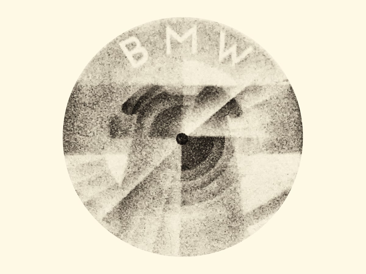
[caption id=“attachment_6220” align=“aligncenter” width=“400”]![]() BMW logo propeller in the journal in 1929[/caption]
BMW logo propeller in the journal in 1929[/caption]
[caption id=“attachment_6221” align=“aligncenter” width=“400”]![]() BMW logo propeller in the journal in 1942[/caption]
BMW logo propeller in the journal in 1942[/caption]
The myth that the modern BMW logo is a legacy of aviation companies appeared after advertising in a magazine published in 1929, which depicted a plane with a rotating propeller, which showed the letters BMW. This advertising appeared at a time when BMW acquired a license for the creation of Pratt &Whitney aircraft engines, and the advertising department wanted to use Roundel and the name of BMW in an attempt to increase sales of its engines. Later, this myth became perpetuated, namely after an article appeared in the BMW magazine in 1942, where a plane with the rotating propeller was also shown.
![]()
When Karl Rapp Motorenwerke GmbH Company developed into the BMW AG Company, they wanted a new BMW logo to be focused on their logo. The Rapp logo was made in the form of a circle where the inscription Rapp was printed on top, and Motor was printed below, there was a figure of a horse in the middle of the logo.
![]()
The new BMW Company used the form of the logo, placed the letters just like Karl Rapp Motorenwerke, but filled the middle of the logo with white and blue colors.
Why is the BMW Logo Blue and White
![]()
Another myth of this logo is the colors that filled the middle of the company’s logo. Many people believe that white and blue colors are associated with the sky, and taking into account the history of the company, associated with aircraft manufacturing, that is why these 2 colors are presented there. In fact, these colors were present on the flag of the free state of Bavaria (which is still a part of Germany today), where the production of the company was located. Blue and White colors were in the opposite order because, at that time, it was forbidden to use national symbols in trademarks.
History of Changes in the BMW Logo
[caption id=“attachment_6242” align=“aligncenter” width=“500”]![]() bmw logo old historic[/caption]
bmw logo old historic[/caption]
It is commonly believed that there have been 5 stages of change in the history of the logo, namely: 1917 (the very first logo), 1933, 1953, 1979, and the current version of the modern 3D logo since 2000.
The BMW logo of 1917
![]()
There were white and blue colors inside the logo, gold edging on a circle and between the inner circles. The lettering was also made in golden color.
The BMW logo of 1933
![]()
The colors inside logo remained the same. The edging along the contour lines of the logo and inside were increased. The BMW lettering was changed into for bolder and clearer one.
The BMW logo of 1953
![]()
The company moved away from the golden color in the logo, and at that time the white color of the logo moldings was used instead. The return of the company inscription on the logo to the font of 1917, only to a slightly bolder one and made in white color. The pale blue color was used instead of a deep blue color in the middle of the logo.
The BMW logo of 1979
![]()
The font color remains white, but the font itself was changed to a more modern, sans serif. The deep blue color was returned to the middle of the logo.
The BMW logo of 2000
![]()
A modern version of a logo made in 3D style.
The basic elements of the logo have not been changed for all the time of the existence of the company, these are:
- Cirсle
- BMW inscription along the contour of the circle
- 2 colors in the middle of the logo which are oppositely located.
New BMW Logo
![]()
We are all used to the blue and white BMW logo, which is often called a “propeller”, although it represents the flag of Bavaria. But soon we will have to get used to its new variations. The most expensive and luxurious models from this carmaker will get a new black-and-white logo, which will be accompanied by the inscription “Bayerische Motoren Werke”.
We are talking about several flagship models in different segments. This is the eighth series coupe, a large crossover BMW X7, and BMW i8 hybrid coupe.
By the way, it is the first time in the history of BMW, when the German automaker will use two systems of the logo on their cars.
![]()