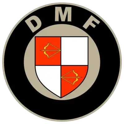
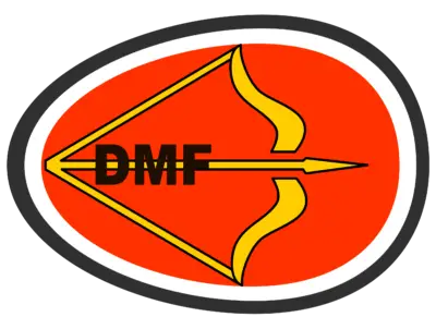
DMF logo
| DMF Info | |
|---|---|
| Founded | 1941 |
| Defunct | 1957 |
| Headquarters | Nederland |
| Key people | Wim Nolthenius Joop Verkerke |
In the first version, the DMF logo used a heraldic design inscribed in a circle, along the contour of which the font name of the brand was located. Heraldic design, in turn, consisted of a classic sharp-witted coat of arms, the base of which is divided into 4 equal parts, located on the principle of a chess field. The two fields containted differently directed bows with a stretched string. In the modern DMF logo, there was only one such bow, with an arrow pointing to the right of the viewer, a symbol of speed. As for the general form of the modern logo, it is more like a stylized egg, and its sharp end is opposite to the direction of the arrow. This design gives the logo a security value.


