Honda logo
| Information about the company Honda | |
|---|---|
| Founded | October 1946, incorporated 24 September 1948 |
| Founder | Soichiro Honda Takeo Fujisawa |
| Headquarters | Minato, Tokyo, Japan |
| Key people | Fumihiko Ike (Chairman) Takahiro Hachigo (President and CEO) |
| Official website | world.honda.com |
History of Honda motorcycles and logo
«Honda» is the Japanese company created by the Tokyo motor mechanic Soichiro Honda. Nowadays the company is a leading manufacturer of automobiles and motorbikes.
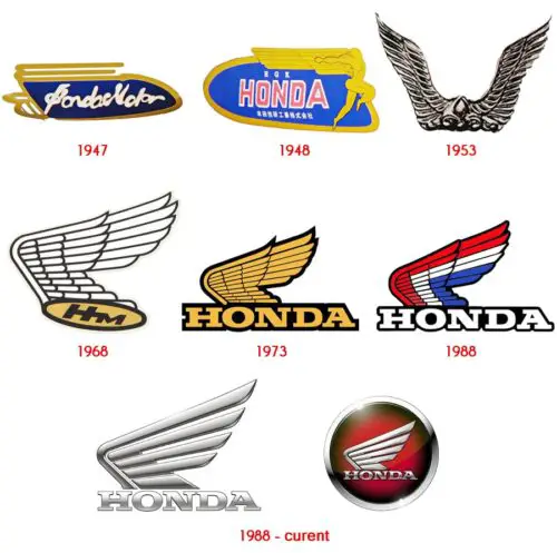
Deep love for the mythology had a huge impact on logotype’s form and outward appearance. The first well-known sign looked like wings — an attribute of the goddess of victory named Nike. By this metaphor, Soichiro Honda meant to say that the company will always achieve goals and overcome any difficulties. In 1947, the new logo was decorated with a fresh prototype engine sample named «Fireplace». This type of engine associated with a huge amount of smoke and the specific smell of turpentine. In 1948, the company changed the logo. The symbol was shown on the presentation of new the motorbike model and this time «wings» belonged to the goodness Victoria. 
In 1953, «Honda» released one more motorbike model. The world was presented «Benly J-Type» (from Japanese “convenient, comfortable”) — with a four-stroke engine of 90cc. The new motorbike was decorated with a modernized logo, where two wings are shown. During the 50’s — 70’s, the company successfully developed and improved itself in the direction of producing motorcycles and new, much better designs. One of them is «СВ750» model, released in 1969, which had a four-cylinder engine with four tailpipes, front disc brake, and an overhead camshaft. Then it was the most powerful motorbike in the world. A new logo was figured exactly on this new model. It looked like one wing with «НМ» letters.
This type of logo was kept till 1973 and had insignificant changes. At the end of 1973, «НМ» letters changed on «Honda»; the description becomes yellow and was outlined on its contours. The emblem has not been changed till 1985 and only then the single color was turned into tricolor (red, white and blue), and the first model, decorated with a new sign was an «RTL 250» motorcycle.
«Honda» company changed its logo a lot of times throughout history. The sign had experimented with its appearance, form, image, and gamma, but the only one thing always stayed the same — the stylized «Н» letter for automobiles and the image of two wings for motorbikes. In 1988 «Honda Motor Co., Ltd.» celebrated its 40th anniversary and changed the emblem to a red color. The logo looked like traditional a wing with the company name description of in Latin. Nowadays, this symbol is active, as it has not been changed the last time.


