Yamaha logo
![]()
Everyone, of course, has heard about Yamaha logo — it is one of the oldest corporations in the world. It was established by an enterprise Torakusu Yamaha in 1897.
| Information about the company Yamaha | |
|---|---|
| Founded | October 12, 1887 |
| Founder | Torakusu Yamaha |
| Headquarters | Hamamatsu, Shizuoka, Japan |
| Key people | Takuya Nakata, President & Representative Director |
| Subsidiaries | Yamaha Motor Company |
| Slogan Yamaha | ”Revs Your Heart” |
| Official website | www.yamaha.com |
History of Yamaha motorcycles and logo
![]()
Many people are familiar with this brand. Yamaha is the Japanese concern which manufacturers motorcycles, engines, musical instruments, acoustic and audio devices, sports equipment, etc. Perhaps, you even used their products. Torakusu Yamaha, the founder, used to be a simple workman. The company started its establishment and market promotion with musical instruments production.
Initially, there must be a phoenix holding a tuning fork in its mouth on the «NipponGakkiCo., Ltd.» company’s logo (the name of the modern Yamaha company). It symbolized a firmness of spirit, work, perseverance, and pursuing the founder’s Torakusu Yamaha goals. A tuning fork in the mouth (a symbol of the ultimate sounding) reflects all the difficulties and hardships the head of the concern had to face building his business step by step. This logo was approved almost immediately, a year after the company establishment in 1898. Thirty years later since the corporation establishment in 1927, the phoenix disappeared. Instead of it, three tuning forks appear on the new logo. Since that time tuning forks became an essential element of the company’s logo. According to the corporate legend, they reflect three principles of Yamaha business — technologies, production, and sales. ![]() Years later the company grew strong and covered more and more segments of the world sales market. Only one thing remained unchanged – three crossed tuning forks making a complex triradiate star. It is important to note the presence of the tuning fork on the logo of the company which doesn’t make a specialty of a musical sphere. The fact is that originally To Kasumi Yamaha founded a company in 1889 named «YamahaOrganWorks». This company worked in a sphere of music and was producing organs. The tuning fork is used for tuning organs and other musical instruments. Only eight years later, in 1897, the company «NipponGakkiCo., Ltd.» was founded.
Years later the company grew strong and covered more and more segments of the world sales market. Only one thing remained unchanged – three crossed tuning forks making a complex triradiate star. It is important to note the presence of the tuning fork on the logo of the company which doesn’t make a specialty of a musical sphere. The fact is that originally To Kasumi Yamaha founded a company in 1889 named «YamahaOrganWorks». This company worked in a sphere of music and was producing organs. The tuning fork is used for tuning organs and other musical instruments. Only eight years later, in 1897, the company «NipponGakkiCo., Ltd.» was founded. ![]() Initially, the company used to sell musical instruments and had experience in manufacturing steel technologies. In 1954, it launched a production of Yamaha YA-1 motorcycle. Its sales were so high that the next year (in 1955) executives created a separate Yamaha Motor Co subdivision. In 1981, the enterprise decided to compete with Honda, the world’s leader of motorcycle producing, and take its first place. So the company started releasing new motor bicycles models, but rivals were too strong. For example, the famous American manufacturer Harley-Davidson made the government do restrictions on the import of Japanese motorcycles to the United States, which lead to large losses of the foreign company.
Initially, the company used to sell musical instruments and had experience in manufacturing steel technologies. In 1954, it launched a production of Yamaha YA-1 motorcycle. Its sales were so high that the next year (in 1955) executives created a separate Yamaha Motor Co subdivision. In 1981, the enterprise decided to compete with Honda, the world’s leader of motorcycle producing, and take its first place. So the company started releasing new motor bicycles models, but rivals were too strong. For example, the famous American manufacturer Harley-Davidson made the government do restrictions on the import of Japanese motorcycles to the United States, which lead to large losses of the foreign company. ![]() In 1982, Yamaha Motor starts cooperation with the French producer of scooters named Motobecane. In 1985, Yamaha Motor became more active on the Indian market and created a joint production with India Yamaha Motor. In 2011, Yamaha Motor purchased the India Yamaha Motor. In 1990, Yamaha Motor started cooperating with Italian Minarelli motorcycle manufacturer, and in 2002 it joined the Yamaha Motor. The history of Yamaha Motor’s logo changes:
In 1982, Yamaha Motor starts cooperation with the French producer of scooters named Motobecane. In 1985, Yamaha Motor became more active on the Indian market and created a joint production with India Yamaha Motor. In 2011, Yamaha Motor purchased the India Yamaha Motor. In 1990, Yamaha Motor started cooperating with Italian Minarelli motorcycle manufacturer, and in 2002 it joined the Yamaha Motor. The history of Yamaha Motor’s logo changes:
- In 1966, the Yamaha logo was created.
- In 1980, the design of the logo was changed. It looked like simple lines without background. It is considered to be the standard version of the emblem.
- In 1987, the logo was changed again. Now it was just a name of company’s founder.
- 1998 was a year of tuning forks return to the logo. In addition, designers created standard and special versions (with background or without).
- In 2016, the logo was standardized.
Yamaha Logo Description
![]() The modern Yamaha logo consists of three tuning forks and a name of the founder of the company written in Latin. This unusual combination is simply explained. Three tuning forks symbolize a strong connection between technology, producing, and sales — three basic elements of the «YamahaCorporation». Today the difference in «YamahaMotor» and «Yamaha» logos is only in the position of the tuning forks. They cut a circle on the «YamahaMotor» logo and they are enclosed in a circle on «Yamaha» logo. In 1916, the enterprise started using three tuning forks crossed together during registration of various trademarks companies producing musical equipment. The very first emblem, which was printed on motorcycle models in 1966, looked like three tuning forks enclosed in a circle on a background. In addition, the logo was completed with the company founder name. Until 1998, there were two versions of the Yamaha Motor’s logo – the standard and special. The standard version looks like special except the tuning forks on the background. In 2016, designers decided to create a single emblem. Nowadays, it presented with simple lines of tuning fork enclosed in a circle and Yamaha inscription.
The modern Yamaha logo consists of three tuning forks and a name of the founder of the company written in Latin. This unusual combination is simply explained. Three tuning forks symbolize a strong connection between technology, producing, and sales — three basic elements of the «YamahaCorporation». Today the difference in «YamahaMotor» and «Yamaha» logos is only in the position of the tuning forks. They cut a circle on the «YamahaMotor» logo and they are enclosed in a circle on «Yamaha» logo. In 1916, the enterprise started using three tuning forks crossed together during registration of various trademarks companies producing musical equipment. The very first emblem, which was printed on motorcycle models in 1966, looked like three tuning forks enclosed in a circle on a background. In addition, the logo was completed with the company founder name. Until 1998, there were two versions of the Yamaha Motor’s logo – the standard and special. The standard version looks like special except the tuning forks on the background. In 2016, designers decided to create a single emblem. Nowadays, it presented with simple lines of tuning fork enclosed in a circle and Yamaha inscription.
Color of the Yamaha Logo
![]() The main color of Yamaha motor is red, which symbolizes peace, safety, prosperity and power. Also, there are some variants of the violet-colored emblem, but this one is mostly referred to Yamaha corporation. Violet is a color of warriors, generosity, and strength.
The main color of Yamaha motor is red, which symbolizes peace, safety, prosperity and power. Also, there are some variants of the violet-colored emblem, but this one is mostly referred to Yamaha corporation. Violet is a color of warriors, generosity, and strength. ![]()
Yamaha Emblems
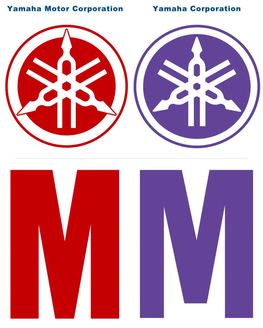 The color is the only thing that differentiates the enterprise logos. Yamaha has a purple emblem, and Yamaha Motor is characterized by red tone. Yamaha Corporation uses the version of logo where tuning forks are enclosed in a circle, while Yamaha Motor has the tuning forks coming outside the circle. Moreover, the «M» letter is different too.