Buell logo
| Information about the company Buell | |
|---|---|
| Founded | 1983 |
| Founder | Erik Buell |
| Defunct | October 30, 2009 |
| Headquarters | East Troy, Wisconsin, U.S. |
| Parent | Harley-Davidson |
| Official website | www.buell.com |
History of Buell motorcycles and logo
«Buell» motorcycle is a great transport created by an American bikes manufacturer, which takes its roots from the history of another more famous vehicle brand. The headquarter of these iron horses` founders is based in East Troy (a little-known US city located in Wisconsin). The business was built from scratch by a former employee of the legendary «Harley-Davidson» motorcycle manufacturer. In 1983 Erik Buell decided to open his own brand of two-wheeled machinery. In 10 years of existence, before mentioned US monopoly-company gained 49% of shares of Buell’s firm. And in 10 years after that «Hаrley» got a complete control over this small manufacturer. Since 2003, motorcycles have been produced by a «Harley-Davidson’s» daughter. In 2006 firm managed to sell its one hundred thousandth bike.
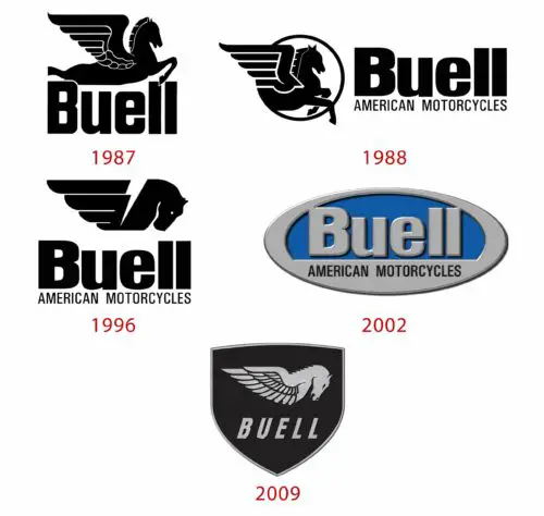
 The «Buell» firm is a subsidiary company of the «Harley-Davidson» group. Previous company logotypes, as its owners explain, were poorly and very simply designed. They looked quite immaturely and absurdly. However, the last Buell logo, which has been existing till nowadays, is considered to be a really good exemplary. Shield form, its maintenance, gothic theme, font, and finally, the image of Pegasus are great. The last one is considered to be the symbol of speed and some external «grace» of this brand motorcycles. Many competitive corporations tried to stole the idea of «winged» Pegasus, but anyway «Buell» is the best among strong rivals.
  The Pegasus theme, in fact, is quite well observed throughout the history of logo changes. So, for example, in 1987 the emblem looked like a figure of a winged horse (Pegasus) with the company name inscription underneath. The logo was «damp». The image looked silly, and emblem did not contain any catchy strokes, lines or elements. In 1988 logotype was rebranded again. So there was the much better version of enclosed in a circle Pegasus image on the left. The «Buell American Motorcycles» inscription was located on right. In 1966 emblem was changed again. Then it looked like the Pegasus’s head and wing with name company inscription underneath: «Buell American Motorcycles». And in 2002 logotype was changed one more time. Unlike previous versions, it became colored, and winged horse disappeared completely. The modern emblem is elliptical; the stable «Buell American Motorcycles» inscription is encircled inside. The color spectrum contains blue, green and black. Lastly, in 2009 Buell logo gained its final shape and has not been changed to this day. Now, this is a shield with horse’s head and wing image inside, and the «Buell» concern inscription on the bottom.


