Ducati logo
![]()
| Information about the company Ducati Motor | |
|---|---|
| Founded | 1926 |
| Founder | Antonio Cavalieri Ducati Adriano Cavalieri Ducati Bruno Cavalieri Ducati Marcello Cavalieri Ducati |
| Key people | Rupert Stadler (Chairman) Claudio Domenicali (CEO) |
| Headquarters | Bologna, Italy |
| Owner | Audi |
| Parent | Lamborghini |
| Official website | ducati.com |
History of Ducati motorcycles and logo
«Ducati Motor Holding S.p.A.» is an Italian company established in 1926, which their occupation is producing the motorcycles. Nowadays it belongs to the German «Audi AG» automobile manufacturer. Not everyone knows that business, set up by brothers Bruno, Adriano, and Marcello Ducati, started its career with radio production (horns, loudspeakers, etc.). The modern logotype Ducati looks like a red triangular emblem with a white stripe inside — the symbol of motorcycles` essential connection with speed. The magnificent Latin inscription «Ducati» is located above the white track.
![]() The very first logo «Ducati» was created together with company’s opening in the 20s. It was fully connected with its radio activities. The logotype looked like a zipper enclosed in a circle and two crossed “wires” with Latin inscription «Radio Brevetti Ducati» above it.
The very first logo «Ducati» was created together with company’s opening in the 20s. It was fully connected with its radio activities. The logotype looked like a zipper enclosed in a circle and two crossed “wires” with Latin inscription «Radio Brevetti Ducati» above it. ![]()
In 1935, the La Società Scientifica Radio Brevetti Ducati company was expanded and relocated to Borgo Panigale, the new district of Bologna. The firm’s logotype has been changed too. Now it looks like inclined letters SSR with the Ducati inscription above, and all this is placed in a circle. ![]()
After the Second World War, the demand for radio equipment noticeably decreased, and «Ducati» which was passed under the public administration, started creating engines and vehicles. In 1949, the firm started releasing engines and vehicles, including motorcycles. That time the company name had to be depicted on a motorcycle’s tank. The old “SSR” logo, which used to be associated with electronics, was too small and elusive for consumers. That’s why designers decided to create a new emblem with a good visible “DUCATI” word. The motorcycle sales were constantly increasing, so in 1953 the enterprise was divided into 2 branches - the Ducati Meccanica SpA (the producer of motorcycles) and Ducati Elettronica (engaged in releasing of components for radio). Accordingly, there was a new logo. The letter “D” on one side complemented with a laurel wreath on the other, and together they formed a circle. Two wings (directed in different sides) and Ducati Mechanica Bologna description were located above. Еhe emblem was shown on all racing motorcycles manufactured in that time. ![]()
In 1959, the enterprise, following traditions of other vehicle manufacturers, presented a new emblem illustrated on motorcycle’s tank. It looked like an eagle, the symbol of freedom. The animal carried in its claws a long pointed flag, on which the words “the Ducati Moto” was depicted. ![]()
In 1967, Under the influence of youth movements, Ducati decided to change the motorcycle logo. The new emblem was created for the Scrambler model. It looked like an average wing circled on a path with the Ducati italics inscription presented in the middle of it. ![]()
In 1975, the classic variant of Ducati logo disappeared. Giorgetto Giugiaro, one of the most popular designers of that time (he became famous for the creation of Volkswagen Golf) was invited to the Ducati team for designing a new emblem. So he created an image of Ducati lettering in the normal font which was made with parallel lines. This kind of logo had been used until 1985. ![]()
In 1985, the enterprise was acquired by Cagiva. New executives decided to keep the production of Ducati brand on the market, but restyle its logo to make it more resemblance with Cagiva. At the same time, they used the same font as the original, but only add a small image of an elephant in the left corner under the lettering. ![]()
In 1998, the company was bought by an American Texas Pacific Group investment firm. It was presented a new logo. This time, the Ducati inscription was created with Univers Italiс font. On the right, we could see a circle divided by an angle into two parts, one-half of which resembles an inclined capital letter «D». Admirers and fans nicknamed it “Chicco di caffé” (coffee bean). ![]()
In 2008, the Landor design studio from Milan presented a new logo created in a shape of an inverted shield or “water drop”, inside of which we could see a curve line and the DUCATI inscription above. The emblem was designed in red colors, which is considered to be the symbol of victory and passion in Italy. Later the lettering and line became white, and the background was printed in red. ![]()
During 1949-1975 this prosperous organization was releasing great high-grade motorbikes. In addition, the company tried to change their logotype by adding to the graphic sign one or two wings. But only one thing never changed — the inscription always contains the company’s and founders` name.
![]()
The contemporary Ducati logo looks like a red-colored inverted triangle (or a water drop) with smooth rounded corners. In the middle of an emblem, we can see the Ducati inscription and curve line, which reminds us that the motorcycles of this brand were created for speed.
Symbol Ducati
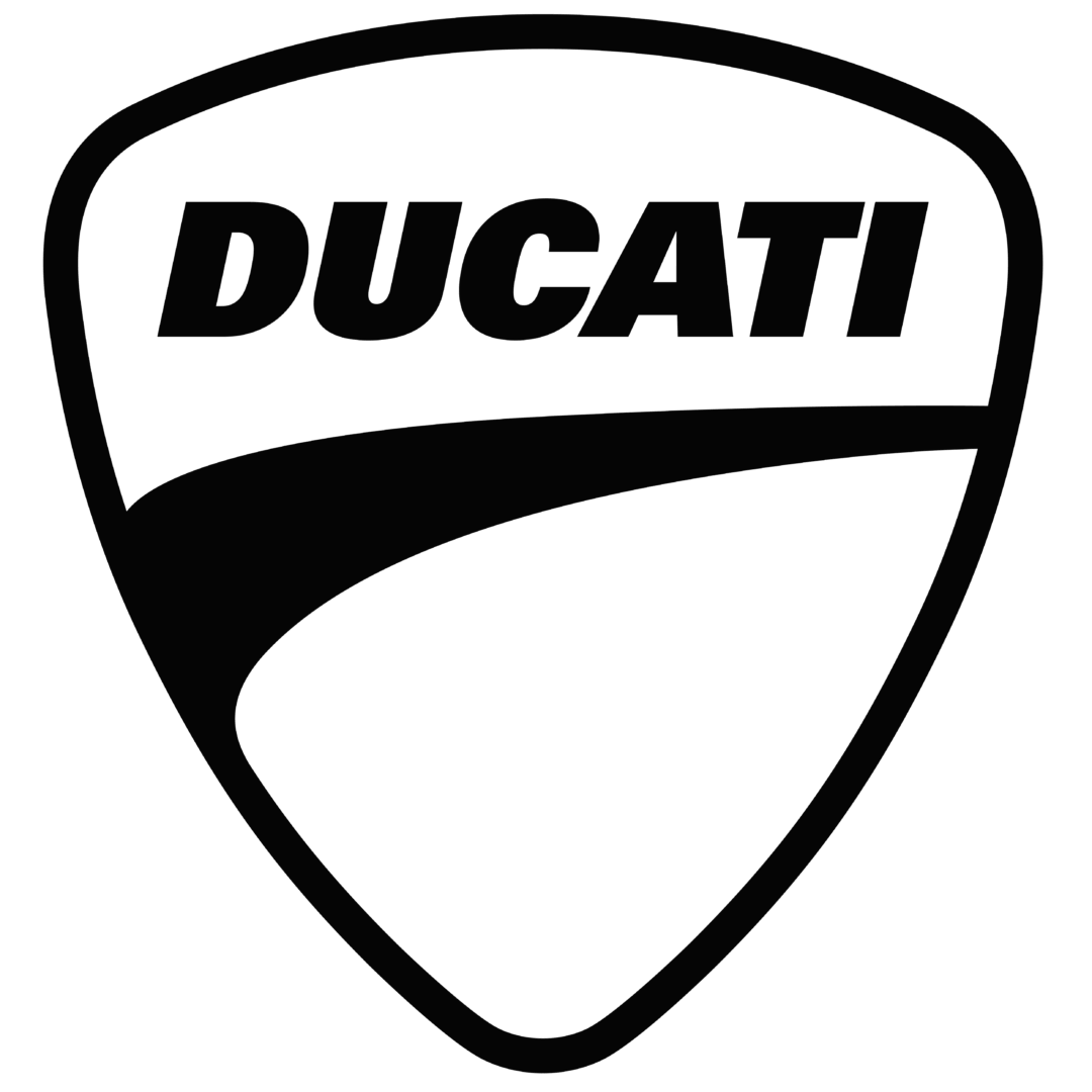
Ducati is a modern symbol made in a red triangular shape, inside of which we can see a trace of the white band. It resembles us that motorcycles of this brand were designed for speed.
Color of the Ducati Logo
![]()
The contemporary Ducati logo resembles a shield painted in red tone. Its primary meaning is a victory, and the color is considered to be the main in the Italian autosport and motorsports.
Ducati Emblems
The most famous Ducati emblems:
- Two crossing letters «S» with lightning inside. (The very first logo which was created in 1927 during the radio electronics production).
- The combined «SSR» and «Ducati» logos, enclosed in the circle (1949).
- The letter “D” on the right and a laurel wreath on the left. (1958).
- The letter “D” on the right and a laurel wreath on the left with two wings above, which are directed to different sides. Also, there is a Ducati Mechanica Bologna description.
- The emblem with an eagle holding a flag where we can see the Мото Ducati lettering (the 1960-s)
- The contour black wing with the Ducati inscription made in italics.
- The logo created by designer Giorgetto Giugiaro (the 1970-s).
- The Ducati emblem with an elephant.
- The Ducati logo with a circle divided into two parts by an angle, the one-half of which resembles a slanted letter «D» (1998).
- The red inverted triangle emblem (shield) with a curved white line (2008).