
Kawasaki logo

| Information about the company Kawasaki | |
|---|---|
| Founded | 1896 |
| Founder | Kawasaki Shōzō |
| Headquarters | Kobe and Tokyo, Japan |
| Official website | global.kawasaki.com |
History of Kawasaki motorcycles and logo

«Kawasaki Heavy Industries, Ltd» is one of the greatest industrial companies around the world. Nowadays it produces airplanes, helicopters, robots, jet skis, tractors, trains, engines, arms, motorcycles, all-terrain vehicles, and other equipment. The company was established by Shozo Kawasaki in 1878 as a small shipyard. «Kawasaki» needed a lot of time to start active development in other directions and explore new horizons.
After recovering from the Second World War, the company began to restore the work. The first experimental engine model (two strokes, volume of 58cc) was created in 1950. It was appointed on bicycles. In 7 years «Kawasaki» presented the «Meihazu 125» motorcycle and that was a real breakthrough. A little bit later, the company released a new improved model «125 В8» which won the gold medal at the Japan competition. During the 60’s — 70’s of XX century, the firm received the rank of the most powerful bikes` manufacturer. A lot of championship motocross and road bikes «Ninja» with Kawasaki logo were created then. 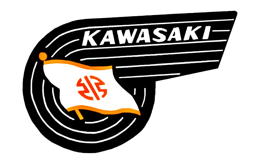
In 1983, the firm released a new, powerful bike «GPZ-900R», which is popular and well-known till now. At the moment, the company has a huge lineup of products «for every taste and budget». In the twenty-first century as in all the previous years, the Kawasaki brand has always been releasing the high-quality motorcycle models.
Recently, the logotype of the company looked like a description in white letters on a black background («Kawasaki» in Latin). Three green strips with different thickness decorate the emblem below. However, since 2011 this Kawasaki logo is considered to be officially outdated.

In 2014, the new updated logo Kawasaki was publicly introduced in the presentation of a fresh «Ninja H2» motorcycle. But, this emblem was already used in the 60s. There we can see a white flag with the image on a black background. The symbol resembles an inverted letter «b».
The modern «Kawasaki Heavy Industries, Ltd.» logotype looks like the capital letter «K», and «Kawasaki» brand name, is written in Latin red letters.
Classic black, white and red colors of Kawasaki emblem were presented in 2014-2015. The red color symbolizes peace, security, prosperity and power. Japanese people usually associate any important stage in life with white color. The black one means courage, valor, and strength.
Kawasaki logo evolution
- 1870s – the River Mark. The oldest Kawasaki symbol is the “River Mark”, seen on flags of ships of the Kawasaki Tsukiji Shipyard, the ancestor of Kawasaki Heavy Industries.
- 1967 – the “K” wordmark. For motorcycles and the wider group, Kawasaki adopted the “Kawasaki” wordmark with the distinctive pointed “K”. It stayed on the bikes for decades.
- 2014 – River Mark on the Ninja H2. The supercharged Ninja H2 and H2R got the River Mark on the nose, a sign that they were built with know-how from the whole Kawasaki group.
- 2021 – River Mark becomes the corporate symbol. When the motorcycle business became Kawasaki Motors, Ltd., the River Mark was adopted as the group’s corporate identity symbol.
What does the Kawasaki logo mean?
The River Mark is a stylized form of the Japanese character for “river” (川, kawa) – the first part of the name Kawasaki. The pointed “K” of the wordmark is meant to look fast and aggressive, matching the Ninja sport bikes.
Why is Kawasaki green?
Lime green became Kawasaki’s racing color in the United States in the late 1960s and early 1970s. Green was then considered an unlucky color in American racing, so it made Kawasaki bikes stand out instantly. Today “Kawasaki green” is as much a part of the brand as the logo itself.
FAQ
What is the Kawasaki River Mark? A stylized Japanese character for “river”, used since the 1870s and adopted as the corporate symbol in 2021.
Does Kawasaki still use the “K” logo? Yes, the wordmark is still used on most motorcycles; the River Mark is reserved for flagship models and corporate use.