MV Agusta logo
| Information about the company MV Agusta | |
|---|---|
| Founded | 12 February 1945 |
| Founder | Giovanni Agusta |
| Headquarters | Varese, Italy |
| Key people | Giovanni Castiglioni (President) |
| Subsidiaries | Cagiva |
| Official website | www.mvagusta.com |
History of MV Agusta motorcycles and logo
«MV Agusta» is an Italian automobile brand of creating the real iron horses originated in last century. Motorcycles of this brand are developed in Cascina Costa, a town located near Milan (Italy). The company was created on February 12, 1945. It became a renowned business branch of «Agusta» aircraft firm, which was established in far 1923. Local Count Giovanni Agusta was the founder of the parent business. But unfortunately, in 4 years he stopped running the company because of his death. His widow and 4 sons took total control of the firm. Vincenzo and Domenico, the oldest 2 of them, set up the vehicle business. After the Second World War, they decided to create the «MV Agusta» motorcycle brand to save the workplaces at their aircraft factory. The «MV» abbreviation was taken from the «Meccanica Verghera» words. The last is the name of the Italian city where the manufacturing of iron horses was started. Interesting, but above-mentioned gentlemen succeed in producing cheap bikes.
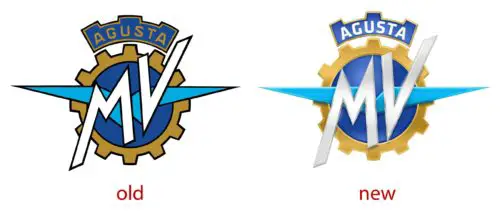
«MV Agusta» is an Italian manufacturer of motor vehicles. Generally, the logotype is stable and almost has not been changed through the history of company’s existing. For example, in 1945 emblem looked like the gear with «MV» capital letters inscribed in a circle. In 1947 the new aviation «wings» were added. Color gamut was constant. The latest logotype, which became official, looks like aviation emblem (the pointed «wings») depicted in a gear. Two bulky «MV» capital letters are located above the «wings». The abbreviation is taken from «Meccanica Verghera» words. Verghera is a city where the manufacturing of motorcycles was started. Above the picture, «Agusta» company name adorns the emblem like a «crown». The aviation thematic is chosen not by accident. In point of fact at the very beginning, the company was an aircraft. But after the Second World War, its owners decided to produce motorcycles. Unlike previous analog emblems, the latest was bulkier and colorfully (however the used colors were the same: yellow, white and blue), and the background becomes black (previous logotypes were pictured on white one).
The new modernized MV Agusta logo was officially presented in Milan in 2015. But not only the emblem was restyled. From this moment logotype has been accompanied by the slogan of the company: «Made with passion». This motto emphasizes on the features of the brand, the manufacturer’s pride of their products and good skills which helped to create such high-quality products. External modifications, as well as a new series of motorcycles models, show company’s great ambitions about future.


