KTM logo
| Information about the company KTM Sportmotorcycle | |
|---|---|
| Founded | 1934 |
| Founder | Johann (Hans) Trunkenpolz |
| Headquarters | Mattighofen, Austria |
| Key people | Stefan Pierer (CEO) Dr. Rudolf Knünz (Chairman) |
| Parent | CROSS Industries AG Bajaj Auto Limited |
| Subsidiaries | Husaberg Husqvarna |
| Official website | ktm.com |
History of KTM motorcycles and logo
«KTM Sportmotorcycle AG» is an Austrian company that produces motorcycles and bicycles. It was founded in 1934 by engineer Hans Trunkenpolz in Mattighofen. From the very beginning, it was the metalworking and repair manufactory named «Kraftfahrzeuge Trunkenpolz Mattighofen».The motorcycle technique was released much later, and since 1954, the company has become the greatest European manufacturer of motorbikes. In addition, the firm received its nowadays name «KTM» (Kronreif & Trunkenpolz Mattighofen).
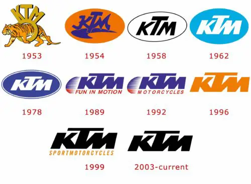
After a successful start in the motorcycle industry, the company did a great breakthrough to this business and moreover maintained the reputation of a really good and productive high-quality manufactory. «KTM» was the first who started producing four-engine models with an air cooling system. In addition, the company created bikes, which had front and rear disc brakes. Among other things, it is the first company, which equipped goods with a hydraulic coupling technology, and in 1998 invented hingeless rear suspension. Such inventions significantly reduced the unsprung mass of a motorcycle. In 1953, «KTM» presented its first «KTM R100» motorcycle model. The logotype contained the company name and was decorated with a tiger. However, it was not official. The first official KTM emblem was presented only in 1954. It looked like a blue striped orange oval with the «KTM» inscription. 
In 1958, production was decorated with a white oval with dark trim and black capital letters “KTM” inside. During 1962-1978 an oval logo was turned into blue, a company name become white colored. In addition, the new «Austria» description appeared. Then, the logo was changed again. From 1978 to 1989 it was a blue oval, which lately became noticeably darker. The lettering «Austria» disappeared. Speaking about the emblem, it was used in two versions: with a white border (original version) and without it. During 1989-1996, the logotype image was significantly changed. That time the «oval» was refused completely. Instead of this, three blue colored capital ‘KTM’ letters were added. The logo contained the description «Fun in Motion» until 1991, but later, till 1996, the emblem’s inscription was changed to the new one — «Motorcycles». From 1996 to 1999, there was a plain orange colored «KTM» inscription. From 1999 to 2003, the lettering turned into black and orange colored «sport motorcycles», postscript appears below. In 2003, the logo was reduced to three capital black colored letters — the name of the company. Nowadays, «KTM» is a successful company with a high demand on the market. It has numerous wins at different exhibitions, as well as the Dakar Rally, Rally South Africa, Darryl Curtis, and Riaan van Niekerk, and this is not the limit of the company’s development.
KTM Symbol
Nobody knows where and why «КТМ» letters were taken. Anyway, there are two versions of its appearing as a brand’s name. The first variant is the initials of Kussin (the main engine manufacturer), Trunkenpolz (the founder), and Moser. The second one is connected with the arrival of Ernst Kronrayfa (in 1950). In this case, initials stand quite simply: «Kronreif Trunkenpolz Mattighofen». The main «original» version is considered to be the latest variant of the symbol.
«KTM Sportmotorcycle AG» company chose the logo abbreviation of the words «Kronreif & Trunkenpolz Mattighofen» (full company name). Three capital letters are black colored and located on a white background. So, after lots of modifications, this version of the emblem has not been changed till now.


